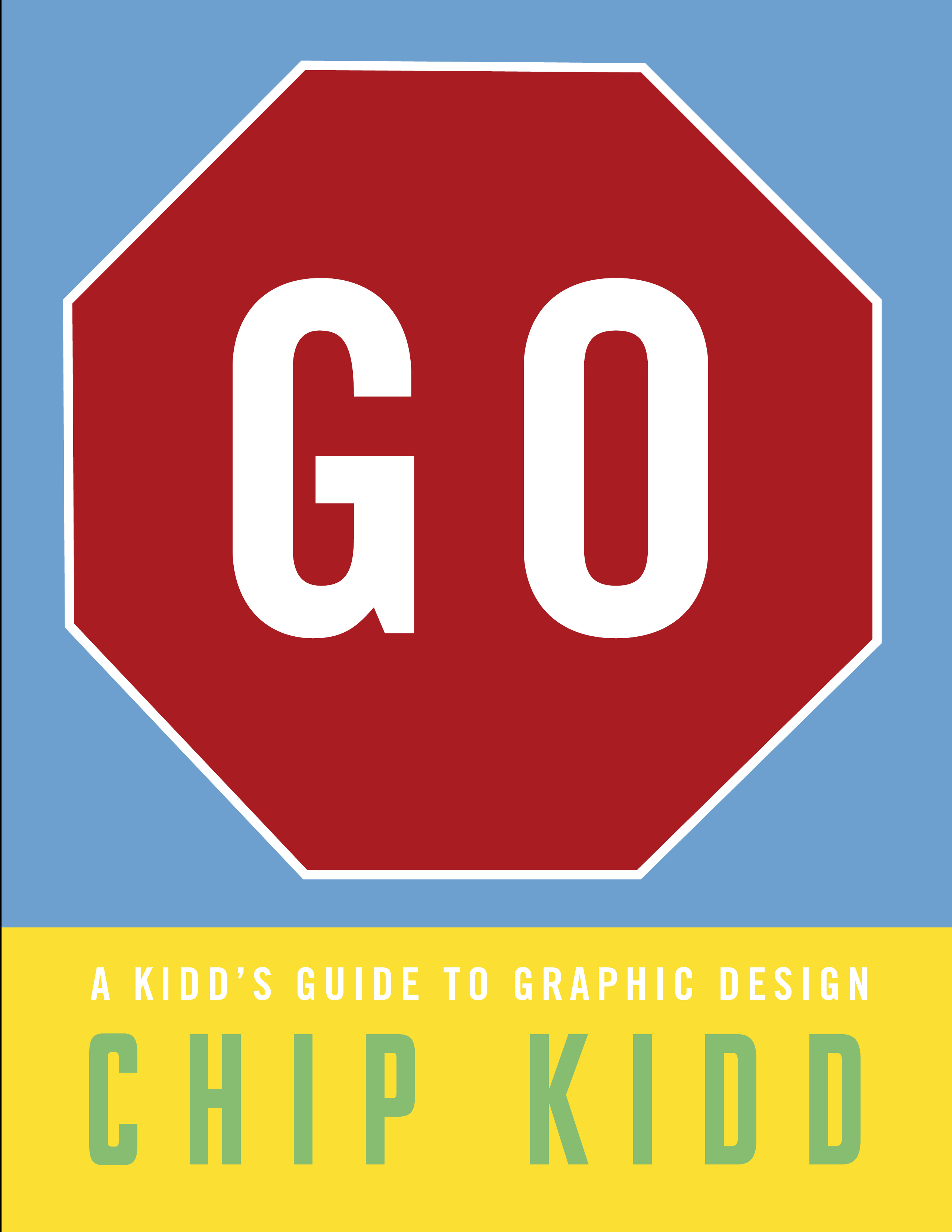
 Before Toby opened his copy of Go: A Kidd's Guide to Graphic Design I would say that he had a basic understanding of design but Chip Kidd's book has given him a level of knowledge and insight into the power and impact of design on our decisions that I was unaware of until I was a good ten years older than he is!
Chip Kidd is a famous American book designer with over 1,000 book covers in his portfolio to date, he is rather better known in the US than over here. His covers are playful, bold and occasionally cross over into other genres, as with his famous logo for Jurassic Park.
This book is essentially a repurposing of Kidd's extensive portfolio for a younger audience, with handy hints and insights thrown in about how the visual world works and what graphic design is all about. At primary level, not all of the themes resonated but there was enough to keep Toby and his younger sister Pippa interested.
However rhe information in Go: A Kidd's Guide to Graphic Design would be invaluable for anyone studying design at secondary level and Kidd's spreads all explain and demonstrate graphic design concepts which follow along the lines of the first year of art school - exploring form, function, size, scale, repetition, pattern, colour and typography.
At five years old Pippa was interested in exploring the sections on colour with me, they focussed on the theory of the feelings different colours evoke and we had fun with the design project which asked her to take something you are always used to seeing a certain colour and painting it something else. Toby loved looking at Chip Kidd's own work and the typography sections. He particularly liked the graphic novel drawings and the facts, especially the author's insider design tricks. The book includes ten different design projects from designing your own visual identity to starting a graphic design collection which appealed to both children.
I foundGo: A Kidd's Guide to Graphic Design really interesting and aesthetically pleasing but felt it was rather sophisticated in its presentation given his young audience. It felt pretentious (his word not mine) in it's overly knowing style and use of "design speak". Chip opens with: "Congratulations, you have decided to open this book, even though you have no idea what it's about, and the cover is weird and seemingly at cross-purposes and possibly even pretentious. But you opened it anyway. And you know what? That was a design decision. Yes indeed, whether you realised it or not, most of the decisions you make, every day, are by design... Take my word for it, you are a designer."
At nine years old Toby is certainly on the young end of the scale for the book but we enjoyed looking at it together very much. If you are looking for a beautifully designed book (exposed chipboard binding, nice heavy, uncoated stock paper) and an introduction to design, art and typography look no further. This book would appeal to professional designers, parent or adults who love design and are familiar with Chip Kidd's work and who want to enthuse pre-teens and teens who have an interest in design, advertising and typography. They will definitely come away knowing more about design than they did before and Kidd finishes with some design resources of magazines, website, museums and organisations to keep them inspired.
PWT rating: ♥♥♥♥♥
Published by Workman Publishing GO:A Kidd's Guide to Graphic Design is available from Amazon.


